
Vitória | Espírito Santo | Brazil
Project scope: visual identity and packaging design.
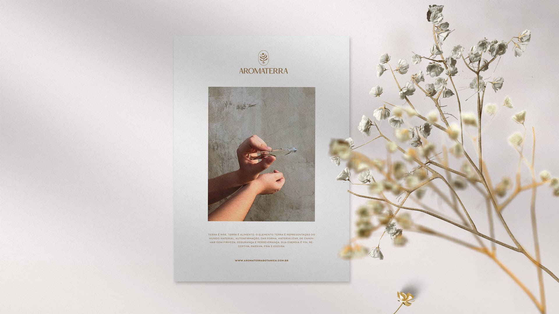
The purpose of the brand is to make the individual reconnect with himself and promote the use and valorization of Brazilian essential oils, through the handmade distillation of native plants, made by hand.
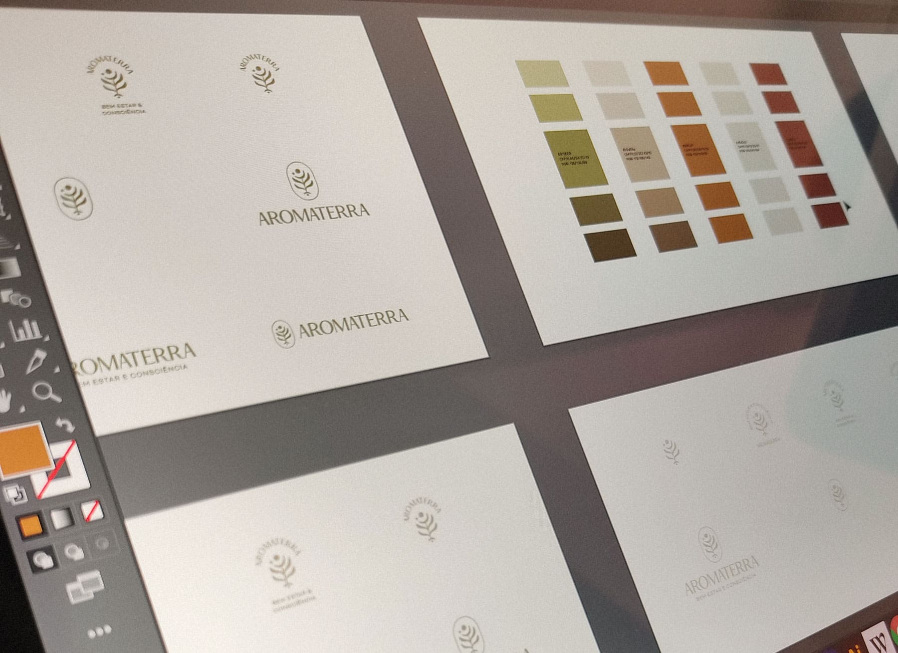
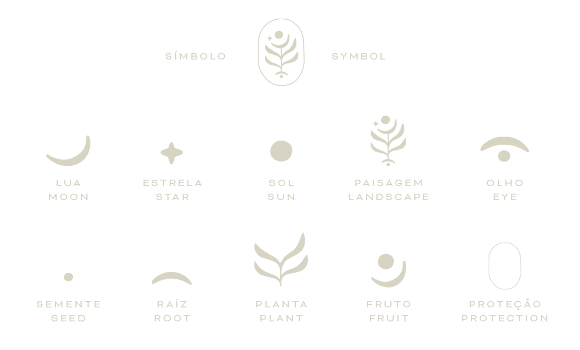
The Aromaterra symbol, with a mysterious and natural air, has several simple elements, each one with its meaning, always connected to the purpose of the brand. Aromaterra has the colors of the earth and plants, varying between bright green and earthy tones. The brand name is written in an elegant and serious typography that together with the symbol brings an air of mystery and seriousness.
The challenge in creating the brand was its applicability. The visual identity solution can be applied with good legibility in all packaging, from the largest to the smallest. That is why the symbol has simple lines, but with a lot of meaning.